
Why Your Website Isn’t Converting (And What Your Visual Content Has To Do With It)
Most people think if their website isn’t converting, something is wrong with the design.
That it needs to be more polished, more modern, more “professional.”
But honestly?
That’s rarely the real issue.
More often than not, your website isn’t the problem.
It’s that nothing around it is actually supporting it.
And I see this all the time.
Beautiful websites. Thoughtfully designed.
But no inquiries, no bookings, no real traction.
Not because the site isn’t good, but because it’s existing in isolation.
Your website isn’t where people meet you first anymore
We don’t really live in a “website-first” world anymore.
People find you through your content.
An Instagram post.
A Pinterest pin.
A shared link.
A random late-night scroll.
And from there, they decide whether they’re curious enough to click through.
Which means by the time someone lands on your website, they’ve already had a mini experience of your brand.
They already have a feeling.
And if that feeling doesn’t match what they see when they arrive?
Something breaks.
Not in a dramatic way, just enough hesitation to leave.
The disconnect no one talks about
This is the part that gets overlooked.
Your website might feel cohesive, intentional, and aligned.
But your content?
It’s often telling a completely different story.
I’ll see things like:
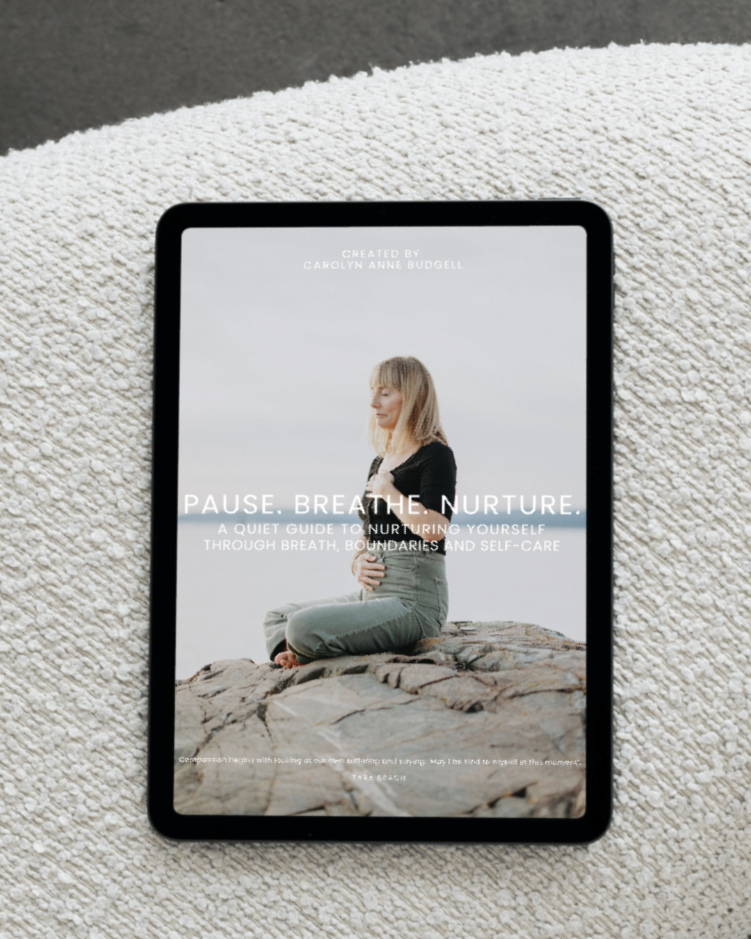
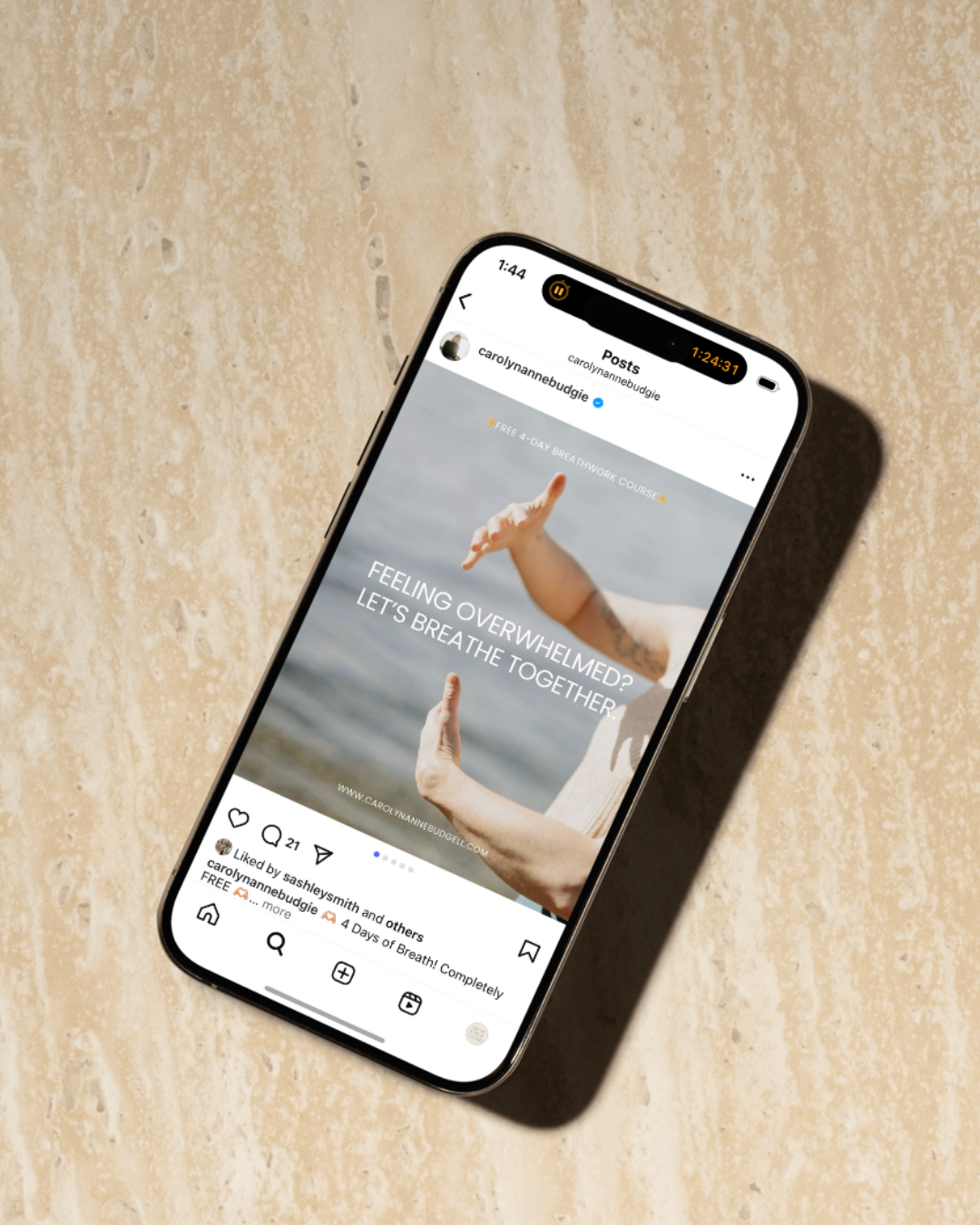
A soft, minimal, grounded website…
paired with loud, inconsistent Instagram graphics
Or a really refined brand identity…
paired with templated, generic-looking PDFs and lead magnets
Or a beautifully designed homepage…
but stories, posts, and emails that don’t visually connect back to it at all
And none of this is “wrong.”
It just creates friction.
Because instead of reinforcing your brand, each touchpoint feels slightly disconnected.
And when people feel that inconsistency, even subconsciously, it affects trust.
It’s not just about having a brand,
it’s about having a visual language
This is where things start to shift.
A lot of people think branding stops at:
your logo
your colors
your fonts
But that’s really just the starting point.
What actually makes a difference is how those elements translate across everything you’re creating.
Your website.
Your social posts.
Your PDFs.
Your offers.
Your shop.
Your emails.
All of it.
A visual language is what makes your brand feel like you no matter where someone interacts with it.
It’s the thread that carries through.
Not identical but connected.


A quick example (because this is usually where it clicks)
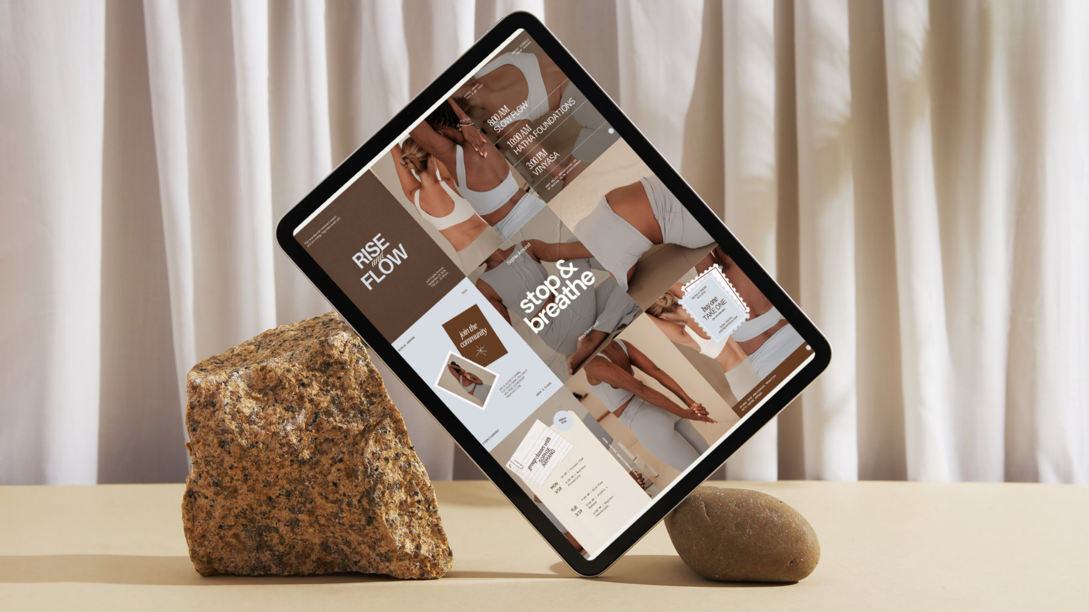
Imagine landing on a website that feels calm, spacious, and intentional.
Neutral tones. Clean layout. Soft typography.
Then you click through to Instagram and see:
bright colors
five different font styles
graphics that feel completely unrelated
It’s subtle, but it creates a disconnect.
Not because one is better than the other
but because they don’t feel like they belong to the same world.
And when things don’t feel cohesive, people hesitate.
They don’t always know why.
They just don’t move forward.
Signs this might be happening in your business
If any of these feel familiar, this is probably where the gap is:
Your website looks amazing but no one is reaching out
You’re posting consistently but it doesn’t feel like it’s building momentum
You keep tweaking your branding but nothing really changes
Your content feels scattered or hard to keep consistent
You’re using templates that don’t quite feel like you
It’s not that you’re doing something wrong.
You’re just missing the connection piece.

What actually changes things
It’s not about creating more content.
And it’s definitely not about constantly redesigning your website.
What actually shifts things is creating a system where everything works together.
Where your content feels like an extension of your website not something separate from it.
That can look like:
repeating certain visual elements
using consistent spacing and layout styles
choosing imagery that reflects the same mood across platforms
designing your content with intention instead of just filling space
It’s less about perfection, more about continuity.
Because when everything starts to feel connected, your brand becomes recognizable.
And when your brand becomes recognizable, people start to trust it.
This is the part most people skip
A lot of business owners invest in a website and expect it to do all the heavy lifting.
But a website can’t carry your brand on its own.
It needs support.
It needs content that leads people there, reinforces the experience, and keeps them connected to your work over time.
That’s the piece that often gets missed.
And it’s also the piece that changes everything.
A softer way to look at it
Instead of asking:
“Why isn’t my website converting?”
Try asking:
“Does everything around my website actually support it?”
Because when your content and your website start speaking the same language, things begin to feel easier.
More aligned.
More natural.
And a lot less like you’re constantly trying to figure out what’s not working.
If you’re starting to see the gap
You don’t need more content.
You need content that actually connects back to your brand.
That’s a big part of the work I do, bridging the space between your website and your day-to-day content so everything feels cohesive, intentional, and aligned.
If you’re feeling that disconnect, you’re not alone.
And you don’t have to keep trying to piece it together on your own.
If you want help bringing everything together, you can explore my services