
10 Squarespace Website Design Tips Every Small Business Owner Should Know
A thoughtful guide from Saasil Ichil Studio
Creating a website for your small business is one of the most important investments you can make, both creatively and strategically. Your website is often the first place where someone forms an impression of your work, your values, and the experience they can expect from you. For many clients, it is also the place where they decide whether they feel a sense of trust and connection with your brand.
If you are building or refining a website on Squarespace, you already have a strong foundation. The platform offers flexible tools, intuitive design controls, and the ability to manage everything without needing to code. With some thoughtful planning and a design mindset, your website can become a supportive, beautiful, and effective extension of your brand.
Below are ten in-depth Squarespace website design strategies that can help small business owners elevate their online presence with clarity, intention, and confidence.

1. Begin With a Clear Brand Foundation Before Choosing a Template
Strong website design always begins long before you place your first section on the page. The foundation of an effective website is clarity about your brand: what it represents, how it feels, and what it offers your audience. Before you open Squarespace, spend intentional time defining the emotional tone and core values of your business. Doing this groundwork allows your website to communicate more powerfully.
Consider questions such as:
What emotions do I want people to feel when they land on my website?
What values guide my business, and how can those values be expressed visually?
Which colours, textures, or motifs feel like a natural expression of my brand’s personality?
Which parts of my business are most important for customers to see first?
This form of reflection becomes a blueprint for every design choice you make. When your brand identity is clear, choosing the right template becomes much easier. Instead of browsing aimlessly, you can quickly identify layouts that match the structure and aesthetic you have in mind.
Squarespace Tip:
Before building any pages, set your global colours, fonts, and spacing in the Design panel. Treat this as establishing your brand kit inside the platform. When these settings are defined early, your entire website becomes more consistent and aligned.
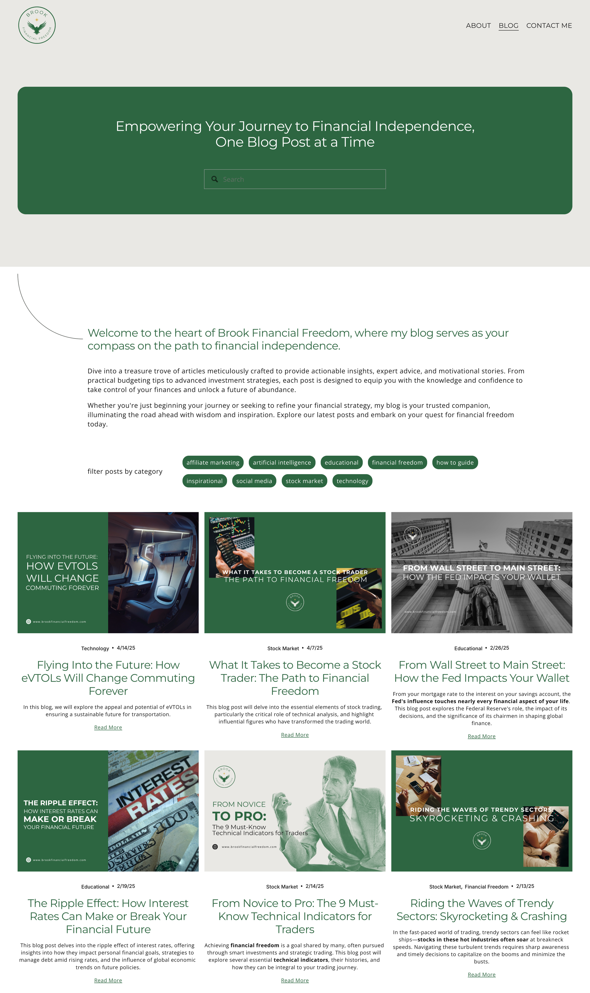
2. Build Navigation That Is Simple, Predictable, and Easy to Understand
Your navigation menu plays a major role in shaping the user experience. Visitors should be able to find what they need within seconds. When the navigation is complicated or cluttered, users often leave even if your content is excellent.
Aim to include only the most essential pages in your main navigation. Five to six menu items is ideal for most service-based small businesses. Pages that contain less essential information, such as policies or FAQs, can comfortably live in the footer. Predictability also matters. Use clear language, avoid unusual menu labels, and group similar pages together.
A good navigation menu feels calm and spacious. It allows visitors to immediately understand where they are and where they can go. The clarity of your menu influences the perceived professionalism of your brand, often before anyone reads a single word.
Squarespace Tip:
Use folders sparingly in your backend structure. Folders can help organize your pages, but try to avoid creating layered submenus on the front end. Too many nested options force visitors to work harder, which can lead to frustration or drop-offs

3. Use White Space Intentionally To Create Breathing Room and Calm
White space, also known as negative space, is an essential part of thoughtful website design. It is not simply empty space. It is a tool that creates balance, ease, and focus. Generous white space helps your content feel more organized. It can make your brand feel elevated and professional, even if your design is simple.
Small business owners often feel pressure to fill every area of the page with text or images. This can make the site feel crowded and overwhelming. When you allow space between sections, blocks, and text, visitors are able to absorb the information more comfortably. The experience becomes more welcoming.
White space can also be used to guide the eye. Strategic spacing draws attention to what matters most. A single call-to-action button surrounded by breathing room carries more impact than a button placed tightly between multiple elements.
Squarespace Tip:
Experiment with section height, block spacing, and padding. Try increasing the vertical spacing in areas that feel cluttered. Even a small change can dramatically enhance the visual calmness of your layout.
4. Prioritize Mobile Design With the Same Attention as Desktop
More than half of all website visitors arrive on mobile devices, and in many industries that percentage is even higher. Squarespace templates are responsive by default, but the default settings do not always deliver the best experience. Thoughtful mobile editing is essential.
Review each page on mobile and ask yourself:
Are the headings readable without zooming?
Is there enough space between text blocks and images?
Does the hero section remain visually strong even when the layout shifts?
Are buttons easy to tap with a thumb?
Does the most important information appear near the top of the screen?
Mobile visitors often scan quickly, so clarity and simplicity are key. Streamlining your content and ensuring that vital actions such as booking, contacting, or purchasing are easy to access will improve the effectiveness of your site.
Squarespace Tip:
Use the mobile-specific styling options under Site Styles. Here you can intentionally adjust font sizes, spacing, and button shapes without affecting the desktop layout. This helps ensure the mobile experience feels intentionally designed, not simply resized.
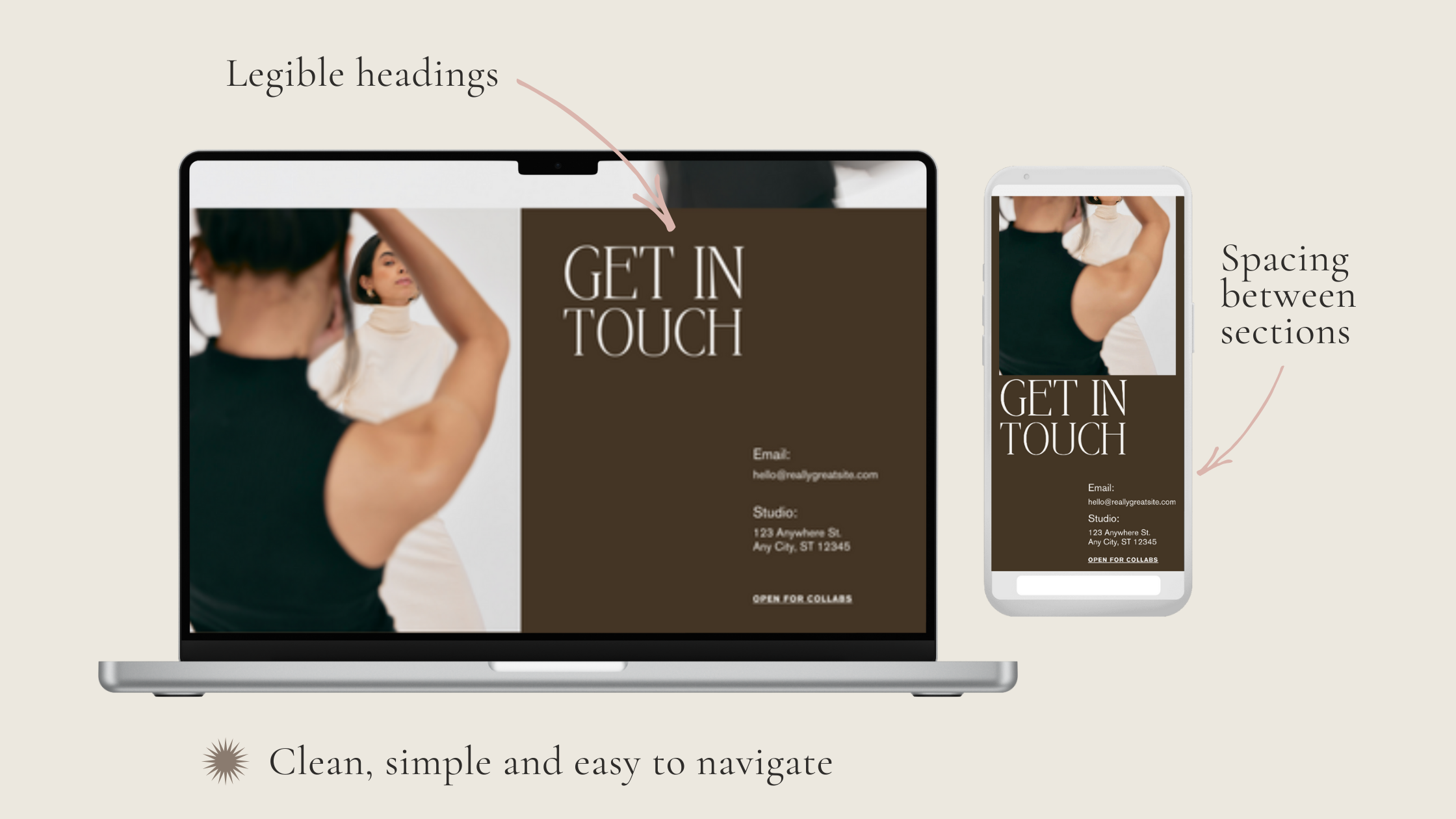
5. Invest in High-Quality Imagery That Reflects Your Brand Identity
Images hold immense power in shaping how your brand is perceived. They communicate emotion instantly and establish the tone for your entire website. Even minimal websites rely on strong imagery to anchor the design and create an inviting atmosphere.
When choosing photos, prioritize quality over quantity. Select images that feel cohesive in colour, lighting, style, and texture. Whether your brand is warm and earthy, bright and bold, or soft and neutral, your imagery should reflect the mood you want your clients to feel.
If hiring a photographer is not an option, focus on high-quality stock imagery that aligns with your palette and aesthetic. The key is consistency. Avoid mixing images with drastically different styles, as this disrupts the visual storytelling and creates a disjointed experience.
Squarespace Tip:
Use the focal point tool on every image. This ensures that the most important part of the photo remains visible across different screen sizes and prevents awkward cropping.
6. Create Clear, Consistent, and Repeated Calls-to-Action
A strong website guides visitors effortlessly toward taking the next step. Calls-to-action, often referred to as CTAs, provide direction and help users understand what to do next. Without clear CTAs, visitors may feel unsure about where to go or what is available.
Examples of strong CTAs include:
Book an Appointment
Explore Services
Shop the Collection
Contact Me
Learn More
The key is consistency. Use the same phrasing throughout your site so visitors learn to recognize your CTAs at a glance. Repetition also strengthens clarity. When a user encounters the same CTA across multiple sections and pages, it reinforces the next step they should take.
CTAs do not need to be aggressive. They simply need to be visible, clear, and placed with intention.
Squarespace Tip:
Establish a global button style that matches your brand. This ensures that every CTA feels unified, polished, and cohesive across the entire site.

7. Build Trust Through Structured Design and Visual Consistency
Trust is not built only through the words on your website. It is also built through the feelings created by your design. A website that is organized, consistent, and visually coherent naturally communicates reliability and professionalism. Visitors sense that you pay attention to detail, and this builds confidence in your work.
Design that feels chaotic or inconsistent can create subtle anxiety in the user experience. Even if the content is excellent, people may feel uncertain or hesitant to engage further. Small business websites benefit from a calm, predictable structure that creates a sense of ease.
To build trust through design, keep an eye on:
Alignment
Repetition of colours and accents
Uniform button styles
Consistent spacing
Predictable page layouts
Clear visual hierarchy
Balanced typography
These elements work together to form an experience that feels cohesive and supportive.
Squarespace Tip:
Use section backgrounds thoughtfully. Alternating between white, light, and slightly darker neutrals can help visually separate content without overwhelming the page.
8. Keep Your Homepage Focused and Purposeful
It can be tempting to fill your homepage with every detail about your business, especially when you want visitors to understand your hard work and the value you offer. However, the homepage functions best when it acts as a curated introduction rather than a complete presentation.
Think of your homepage as the entrance to a building. Its job is to welcome visitors, orient them, and help them decide where to go next. If the space is filled with too much information, visitors may feel overwhelmed or unsure about what to focus on.
Your homepage should accomplish a few key tasks:
Introduce your brand clearly
Communicate your main message
Highlight your primary offerings
Establish visual tone and atmosphere
Invite visitors to explore deeper
Present a clear call to action
The most successful homepages are the ones that feel open, intentional, and easy to navigate.
Squarespace Tip:
Use button blocks rather than text links for key directions. Buttons draw the eye naturally and make it easier for visitors to understand where the most important next steps are located.

9. Use Layout Patterns That Support Natural Reading Behaviours
Effective website design respects how people naturally read and scan information online. Studies show that users typically scan in Z-patterns or F-patterns, where the eye moves across the top of the page and then down, absorbing key points along the way.
Squarespace provides layout structures that support these reading behaviours. Instead of trying to create highly unconventional layouts, lean into the patterns that feel intuitive to most users.
Helpful structures include:
A hero section followed by a simple introduction
A service overview section with evenly spaced blocks
A three-column layout that highlights features or offerings
A stacked structure that moves from introduction to explanation to CTA
When your layout aligns with natural scanning patterns, visitors can understand your content more easily and stay engaged longer.
Squarespace Tip:
Explore the built-in layout templates for each section. These templates are based on established design principles that already support intuitive reading.
10. Refresh Your Website Seasonally To Keep It Current and Engaging
Your website does not need a full redesign every year. However, small seasonal updates can keep your business feeling relevant, active, and aligned with what is happening in your brand or industry. Regular updates also signal that your business is engaged and attentive.
Consider refreshing elements such as:
Homepage images
Featured services
Testimonials
Portfolio examples
Seasonal promotions
Blog posts
Colour accents
Key announcements
Even small updates can create new energy and provide returning visitors with something fresh to explore.
Squarespace Tip:
Duplicate any page before making major adjustments. This allows you to experiment with changes without altering the live version of your website until you are ready.
Final Thoughts: Thoughtful Design Creates Connection
Designing your website is not simply a matter of checking tasks off a list. It is an opportunity to create an experience that feels supportive, aligned, and true to your brand. A thoughtfully designed Squarespace website helps your audience feel welcomed, grounded, and confident in what you offer.
When your website reflects your values and communicates clearly, it becomes a meaningful tool for connection. Visitors can sense the care you put into your business, and this helps them trust your work.
If you are ready to refine your existing website or build something new that feels aligned with your brand, Saasil Ichil Studio would be honoured to support your vision. Thoughtful, grounded design can transform your digital presence into a space you feel proud of.